Do not let one description decide the whole palette
When you describe your skin as olive, it is tempting to search for a single list of colors that must work. But that shortcut leaves out the individual garment, the rest of the outfit and your preferences. A dark-haired person does not need to begin with an all-dark wardrobe, and a greenish-looking photograph is not enough to choose a season.
You can leave the label unresolved while making a useful decision between two tops. The aim is a wardrobe you enjoy, not agreement from every person who sees a photo.
Check the photograph before judging the garment
Adobe explains that white balance affects how colors appear in photographs. If your face, wall and clothing all look warmer in one image, do not attribute that entire change to the garment beside you.
Use the same position, background and light for a comparison. Avoid beauty filters, and check the mirror as well as the images. If a cloud passes or the camera changes exposure noticeably, repeat the pair rather than comparing incompatible pictures. A photograph is useful evidence about that photograph; it is not a perfectly calibrated view of your coloring.
Separate three different styling questions
Try these comparisons using clothes or plain fabric you already have. They are an organizing exercise, not a validated typing method.
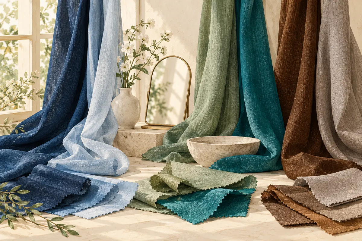
- Light or dark: Compare a lighter and darker version of a similar color, such as two blues. Note which you prefer in the outfit you intend to wear.
- Muted or vivid: Compare a subdued color with a clearer, stronger version. Try to avoid changing every other feature of the garment at the same time.
- Warmer or cooler-looking: Compare a pair such as a warm brown and a cooler-looking taupe, keeping their depth reasonably similar. If they differ greatly in darkness, record that limitation.
You may find that one question matters more to your preferences than the others. For example, several darker fabrics might appeal while warmer versus cooler choices remain mixed. That is still useful information.
Keep the observations more specific than the label
Write “I prefer this deep blue to this pale blue with my usual makeup” rather than “all pale colors are wrong.” One fabric does not represent every shade, finish and garment in a category.
Keep a short list of favorites, uncertain comparisons and colors you simply dislike. Repeat only the decisions that matter to a purchase or outfit. If you already own clothes you love, use them as references instead of assuming an unfamiliar palette must replace them.
Decide whether more analysis would help
If you want professional guidance, ask how the analyst handles mixed preferences, photographic limitations and clients who do not enjoy every recommended color. Our consultation checklist can help you evaluate the service.
An app can provide a suggested palette to explore, but cannot guarantee that every photo or every analyst will produce the same label. Once you have several reliable clothing colors, use them to build a practical wardrobe palette. You can do that before settling the seasonal debate.
Common questions
Does olive skin automatically mean Autumn?
Do not choose a whole wardrobe from that description alone. Compare actual colors and keep the season open if the evidence is unclear.
What if gold and silver both look good?
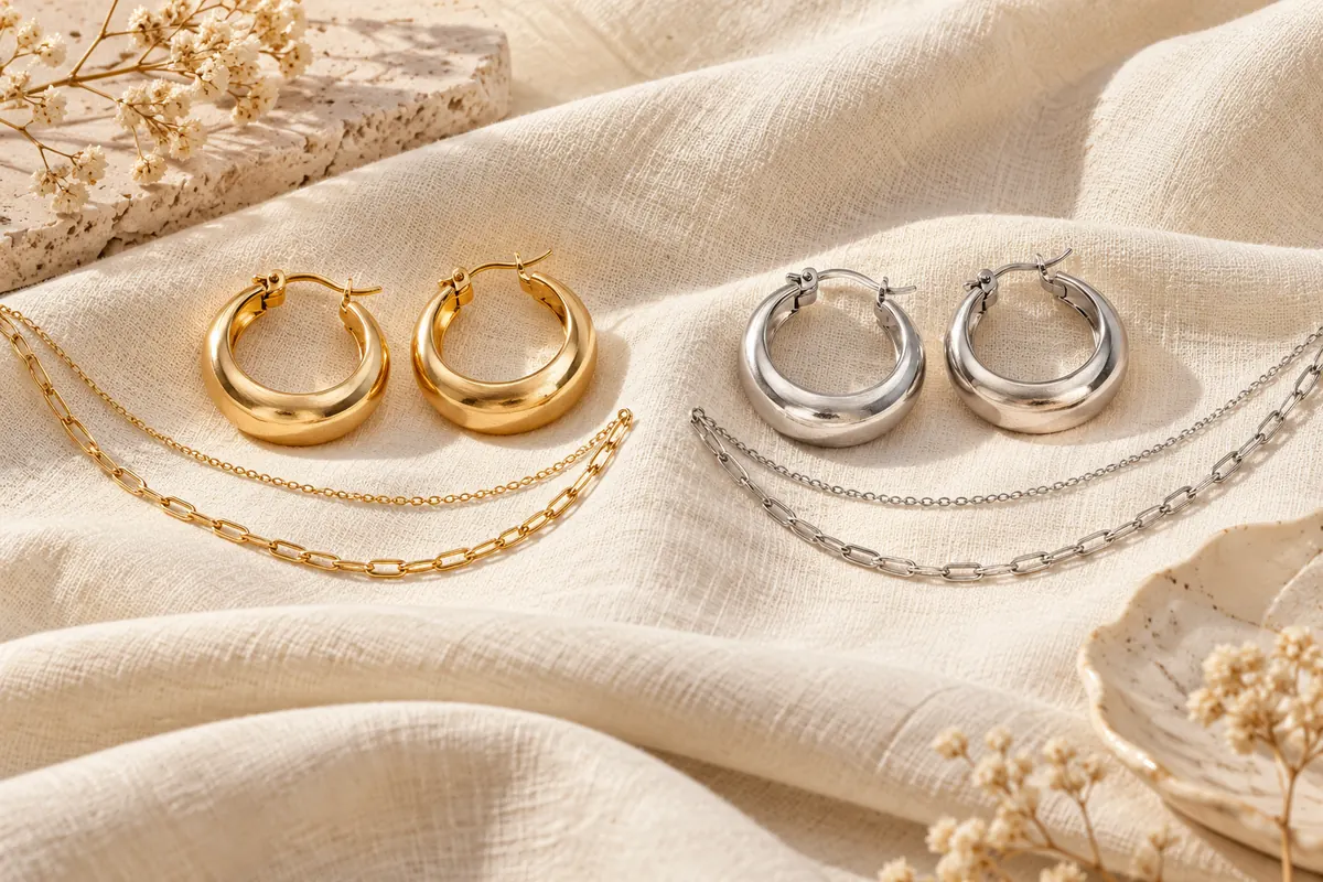
Wear the pieces you enjoy. A jewelry preference is not enough by itself to settle every clothing-color decision.
Should I discard colors outside my suggested season?
No. Keep clothes you like and use a suggested palette to generate ideas, rather than as a reason to remove useful pieces.
Sources & further reading
Sources checked October 26, 2026. Outfit examples and decision exercises are our styling suggestions, not measured rules about attractiveness. Sources have not endorsed this article or our app.
Published by the developer of Stylist AI. Our editorial approach · Suggest a correction
← Back to the journal