Why can the same person get different seasons?
Conflicting Summer and Autumn suggestions can make a simple clothing decision feel complicated. Start by checking whether the comparisons use the same evidence, then focus on the fabrics you enjoy wearing.
Start by checking whether people are judging the same evidence. A warm indoor selfie, a shaded outdoor photo, and a picture with lipstick are different comparisons. Adobe’s explanation of white balance shows why lighting and camera processing can shift colors throughout an image. A warmer-looking photo does not, by itself, establish a warmer season.
There is also a difference between asking “Which seasonal label fits?” and “Which of these tops do I prefer on myself?” For your next purchase, the second question may be easier to answer.
The useful difference: soft and cool, or soft and warm
The Concept Wardrobe’s seasonal comparison describes the shared muted quality and the cooler-versus-warmer distinction. Treat this as a styling framework, not a test of your health or an objective measure of attractiveness.
Soft Summer direction
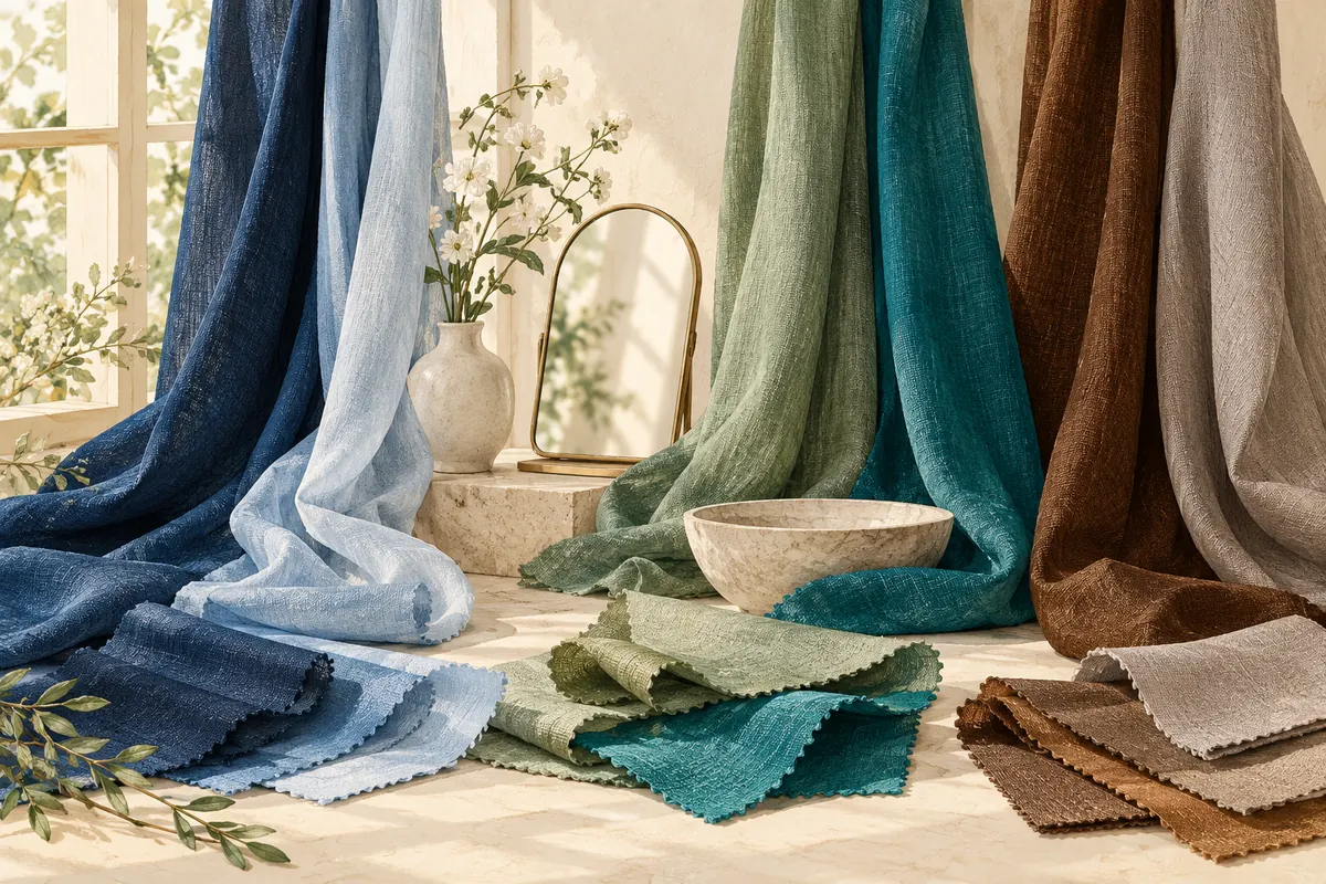
Explore softer, cooler-looking shades. For a first comparison, try a muted rose, a gray-blue, or a soft plum you already own.
Soft Autumn direction
Explore softer, warmer-looking shades. Try a subdued peach, an earthy green, or a warm brown from your wardrobe.
Those are starting examples, not a complete palette. Names such as “rose” or “olive” cover many different shades. The fabric in front of you matters more than the name on its label.
A small fabric comparison you can do with what you own
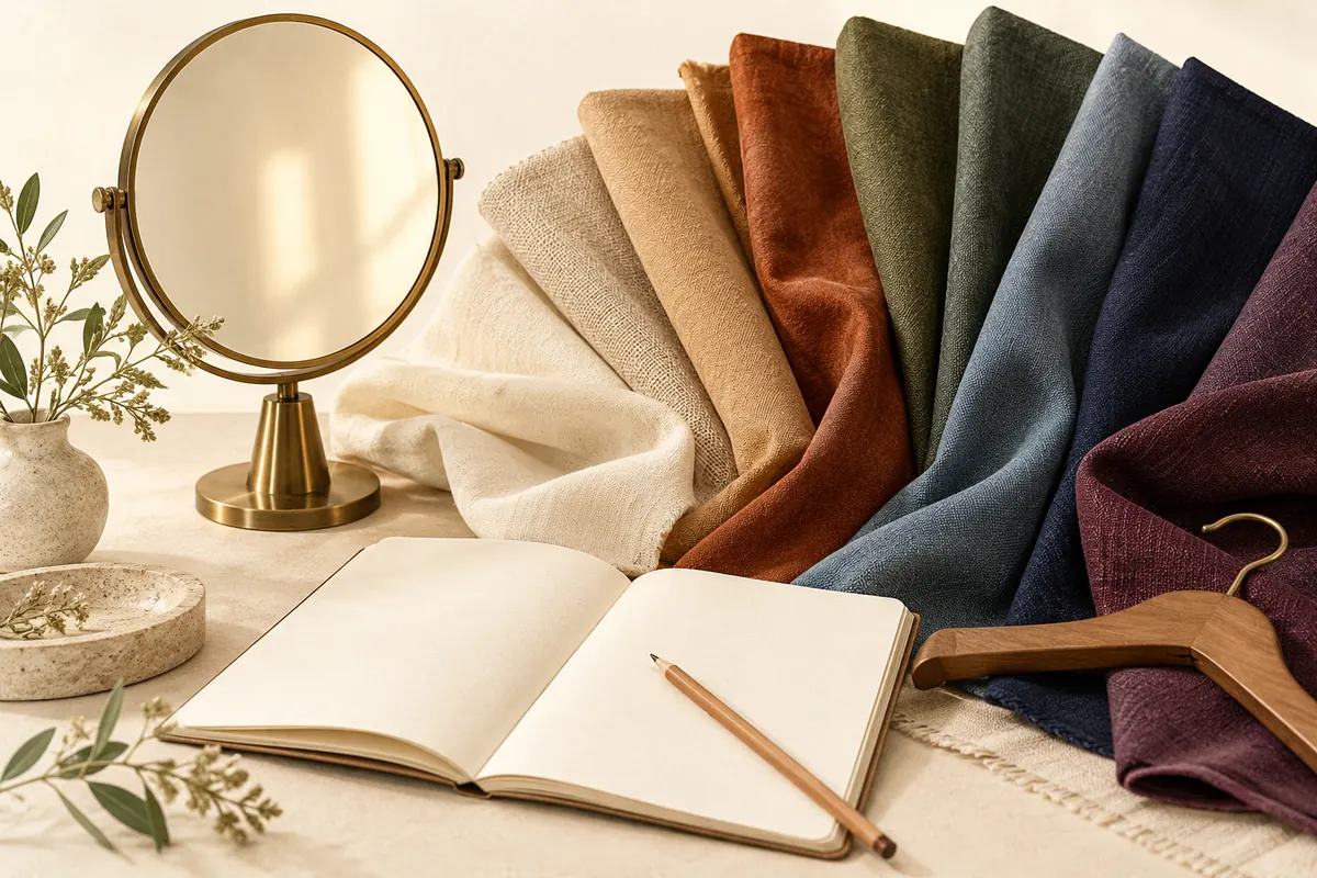
Here is our suggested decision worksheet. It is a practical way to organize your observations, not a validated color-analysis test.
- Choose one decision. For example: “Which of these two sweaters would I wear with my usual jeans?” Avoid testing your entire wardrobe at once.
- Pick a reasonably comparable pair. Two plain, similarly soft-looking fabrics make the question clearer than a pale pastel versus a neon print. If one is much darker, note that difference.
- Keep your setup steady. Use the same spot, background, camera distance and lighting. Avoid filters and beauty effects. For a comparison of your coloring, try it without color cosmetics; for an everyday outfit decision, your usual makeup is relevant, but keep it the same for both.
- Swap the fabric, not the whole scene. Hold each near your face. Look in the mirror as well as at the photos. If the wall or your whole face changes brightness or color between pictures, the camera may have changed the comparison.
- Write one observation. “I prefer the gray-blue near my face” is useful. “I am definitely a Summer forever” is more than this one comparison can tell you.
- Try another pair later. Keep a short list of shades you repeatedly enjoy wearing. An unclear pair can stay unclear.
Stop if you find yourself scrutinizing every shadow or freckle. The goal is to make getting dressed easier. A color preference is not a verdict on your appearance.
Use a short record instead of another round of votes
For each comparison, write: the two garments, where you tested them, the one you preferred, and whether you would actually wear it. Add “uncertain” whenever that is the honest answer.
For example: Blue-gray knit / soft peach knit. Same window. Prefer blue-gray with my everyday makeup. Both work with my trousers; keep both. This records a usable decision without pretending that a single pair settles your season.
If every pair seems inconclusive, take a break before spending money on a new wardrobe or another opinion. You can build outfits around the clothes you already like while leaving the label open.
Where Stylist AI can help
Stylist AI brings a seasonal color profile, personal palette, color combinations, and a camera-based color comparison into one iPhone app. You can use a suggested palette as a reference while exploring clothes you already own or comparing a shade while shopping.
Use the same care with your photos and lighting that you would use for any online comparison. An app’s result is a starting suggestion; we do not claim that a selfie, a match score, or a season label proves what you must wear. If the recommendation conflicts with what you consistently enjoy in person, keep that observation.
We make Stylist AI and benefit if you install or subscribe. The app is optional: the fabric comparison above also works without it.
What should you wear while you’re still unsure?
Choose one familiar outfit and change just the item you are deciding about. Keep the trousers, shoes and accessories you already enjoy. If a favorite color feels stronger than you want near your face, try it in a bag, shoe, or smaller detail and see whether you prefer that balance.
You can borrow a shade from another palette, wear a color because you love it, or decide that seasonal analysis is not useful for this purchase. A helpful system should support your choices.
Common questions
Can I be both Soft Summer and Soft Autumn?
These are neighboring labels within a styling framework. You may enjoy colors associated with both. You can use a mixed set of favorites without proving that you belong equally to two categories.
Does brown hair and blue eyes mean Soft Summer?
That description alone is not enough for a reliable wardrobe decision. Compare the actual garments under consistent conditions rather than assigning a season from two feature names.
Can an app settle a disagreement?
An app can offer a suggested profile and a palette to explore. It cannot guarantee agreement with every analyst or compensate perfectly for every photo and lighting condition.
Sources & further reading
Sources checked October 26, 2026. The comparison worksheet is our practical suggestion; seasonal categories are a styling framework. Sources have not endorsed this article or our app.
Published by the developer of Stylist AI. Our editorial approach · Suggest a correction
← Back to the journal