Four directions beyond your usual stripes
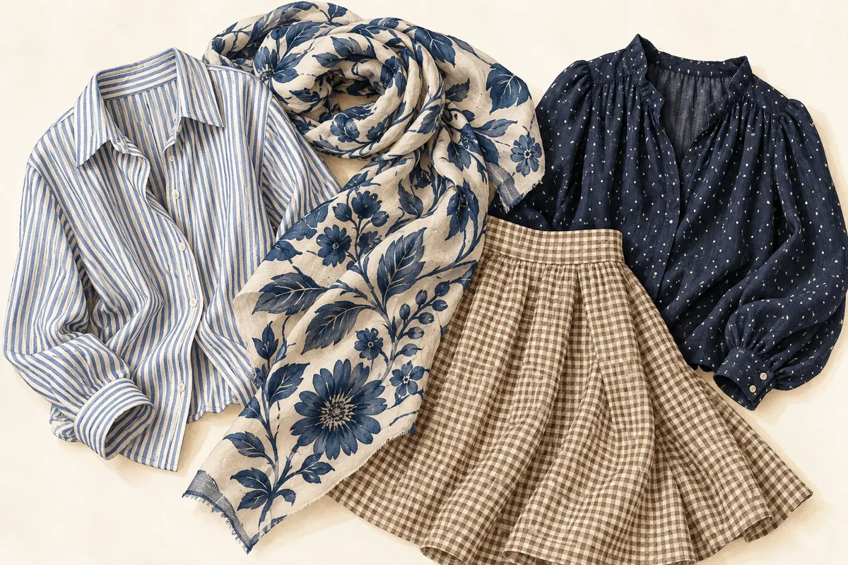
- Checks: Try a small check in a shirt or skirt. Compare it from a few steps away; you may prefer the overall blend of colors to the close-up pattern.
- Botanical prints: Look at both the flowers or leaves and the background. A small floral on a dark base gives you a different outfit option from a large, widely spaced motif on cream.
- Abstract shapes: Try irregular blocks, brush-like marks or curved forms if literal flowers do not appeal. The same color combination can feel quite different in a different design.
- Dots: Compare tiny, closely spaced dots with large, separated ones. Choose the version you enjoy at the scale of a whole garment.
These are directions to explore, not a ranking of prints. If a pattern interests you but a dress feels like too much, try a scarf, shirt or bag first.
Look at three features before buying
Color: Identify the background and one prominent detail. Those are possible connections to clothes you already own. You do not need to reproduce every minor color elsewhere in the outfit.
Scale and spacing: Look at how large the motifs are and how much plain space surrounds them. A product close-up can make a tiny pattern look much bolder than it appears when worn.
Garment shape: Check where the pattern falls across seams, folds and the parts of the garment you notice most. If you dislike the cut, a beautiful print will not necessarily make the item comfortable or useful.
Try one of these first pattern mixes
These examples deliberately use a shared color as a starting point:
- A blue-and-white narrow striped shirt with a larger blue botanical print in a scarf.
- A small cream-and-brown check with a more open abstract print that also contains cream.
- A navy dotted blouse with a wider navy-and-burgundy stripe in a bag or skirt.
Keep shoes and another large piece plain for the first trial so you can focus on the two prints. Then change the balance if you want more detail. The goal is to find a combination you like, not to satisfy an exact rule about pattern size.
If the combination feels too busy
Change one feature at a time. Reduce one print to a smaller accessory, replace one with a lower-contrast version, or add a plain layer between the printed pieces. Look at the full outfit again after each change.
If none of those versions appeals, wear the prints separately. They do not have to work together to be useful clothes. You may prefer variation across your wardrobe rather than multiple patterns within one outfit.
Connect a print to your palette
Pull one visible color from the print and try it in a plain item you already own. A green detail might connect to an olive jacket, while a pale background might connect to a cream shirt. They can be related without being identical.
A camera-based color check can help you inspect a single area of fabric, but it does not establish how an entire multicolored pattern will look as an outfit. Consider the background, small details and overall arrangement in person.
For more pairing ideas, see our outfit color combinations. To make prints part of a broader plan, start with your most-worn wardrobe colors.
Common questions
Do mixed prints always need a shared color?
No. A shared color is one useful starting exercise. If you enjoy a combination without it, you do not need to change it.
Can a print work if only some colors are in my palette?
Yes. Consider the complete garment and outfit. A tiny detail outside a suggested palette does not automatically make a print unsuitable.
Do I have to mix patterns to wear prints well?
No. A single printed piece with plain clothes can be the whole outfit. Mixing is optional.
Published by the developer of Stylist AI. Our editorial approach · Suggest a correction
← Back to the journal