Three different questions
The Concept Wardrobe’s framework distinguishes value, contrast and chroma. Here is a practical translation for your wardrobe:
- Depth or value: Is the fabric light, medium or dark?
- Brightness or intensity: Does it look clear and vivid, or grayed and muted? Everyday use of the word “bright” can also mean light, so clarify what you mean.
- Contrast: How different are the colors next to each other, for example a pale top against dark trousers?
Warm versus cool is another comparison. Changing several qualities at once can make it difficult to understand why you prefer a particular top.
Choose a pair that answers one question
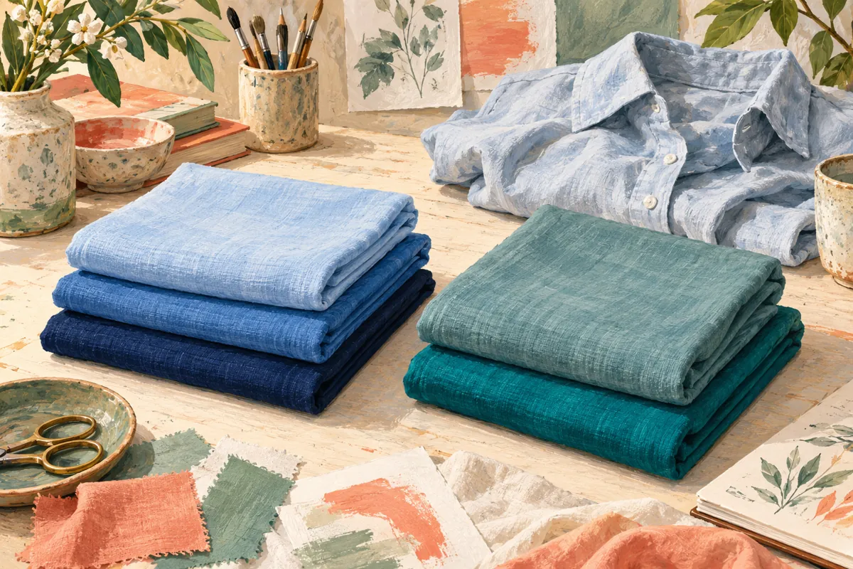
For a depth comparison, start with two fabrics in a similar color family and with a similar finish, such as a medium blue and a deeper blue. For an intensity comparison, try a grayed teal and a clearer teal at roughly similar depth. The pairs will not be laboratory-perfect; simply note obvious differences.
Hold each near your face in the same setup. Ask which you prefer and whether the preference repeats in the mirror. Avoid comparing a pale beige knit with a vivid fuchsia satin blouse and calling the result a pure warm-versus-cool test.
If your wardrobe does not contain a useful pair, do not buy one just for the experiment. You can record “several things changed” and keep the preference without claiming an explanation.
Change outfit contrast while keeping the top
Wear one familiar top with light trousers, then dark trousers. Or keep the outfit and add a lighter collar or scarf. This lets you explore the overall arrangement without replacing every color.
A charcoal-and-ivory outfit can have a strong light-dark difference without vivid hues. A green-and-blue outfit can use more saturated colors with a smaller light-dark difference. These are two different styling choices, and you can like both.
Look at the whole outfit from a normal distance. Cropping down to individual facial shadows can distract from the actual decision: would you enjoy wearing this combination?
Record preferences without overclaiming
Use a short note with three columns: what changed, what you preferred and what remains uncertain. For example: “Medium blue versus navy, similar shirts; prefer navy; fabric thickness also differs.” That is enough to guide a purchase.
One deep shade does not prove that you need every deep shade. Likewise, one dull-looking photograph does not prove that muted colors are unsuitable. If the entire image changes color when you swap a drape, check our photo setup guide before interpreting it.
Use the distinctions while shopping
If a top feels almost right, ask for a version that is darker, lighter, clearer or more muted instead of searching only by seasonal label. Retail color names are broad; compare the garments you can actually buy.
Stylist AI can help you explore palettes and camera-based color comparisons, but a result is still a styling suggestion. Use these terms to understand your preference and build outfits around it, rather than chasing a single number or a perfect label.
Common questions
Does high contrast mean I need neon colors?
No. Contrast describes a difference between colors; vividness describes the intensity of an individual color. A black-and-white outfit can be high contrast without neon.
Is deep the same as warm?
No. Lightness and darkness are a separate comparison from warm and cool direction. Test the specific fabrics rather than joining the terms together.
Sources & further reading
Sources checked October 26, 2026. The wardrobe comparisons and outfit ideas are our editorial suggestions, not validated personal diagnostic tests. Sources have not endorsed this article or our app.
Published by the developer of Stylist AI. Our editorial approach · Suggest a correction
← Back to the journal