What the two palette families are trying to describe
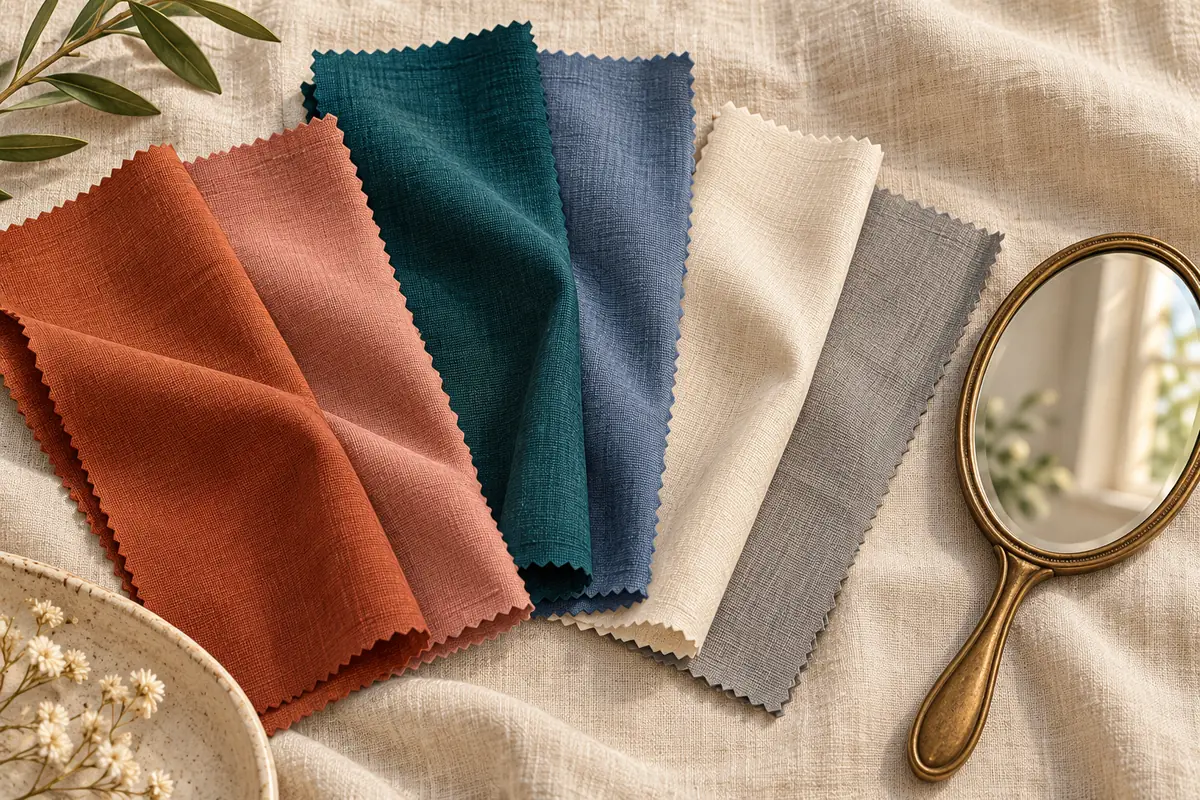
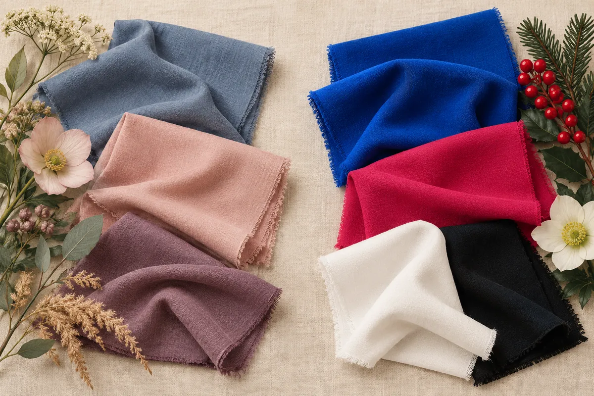
In The Concept Wardrobe’s True Summer framework, the palette is cool and muted. Its True Winter framework uses cool, clearer colors and stronger light-dark contrast. These descriptions give you two styling directions to compare; they are not a measurement of attractiveness.
Start with that broad difference before choosing a subtype. A person can enjoy a muted blue shirt and a bright scarf for different purposes. The useful question is which direction makes it easier to assemble outfits you like.
Start with two comparable color pairs
Try a softer slate blue beside a clearer blue, then a dusty rose beside a clearer raspberry. These are example comparisons, not prescribed test swatches. Choose garments of roughly similar depth and fabric finish so you are not comparing a pale matte T-shirt with a dark sequined top.
- Use steady daylight and the same mirror position.
- Keep makeup, hairstyle and background consistent.
- Change one garment at a time.
- Notice whether you prefer the overall balance, the color itself, or the garment’s shape.
- Repeat another day with a second color pair.
If you only have one useful pair, record a tentative clothing preference. There is no need to buy a rack of drapes to finish a category.
Test outfit contrast as a separate choice
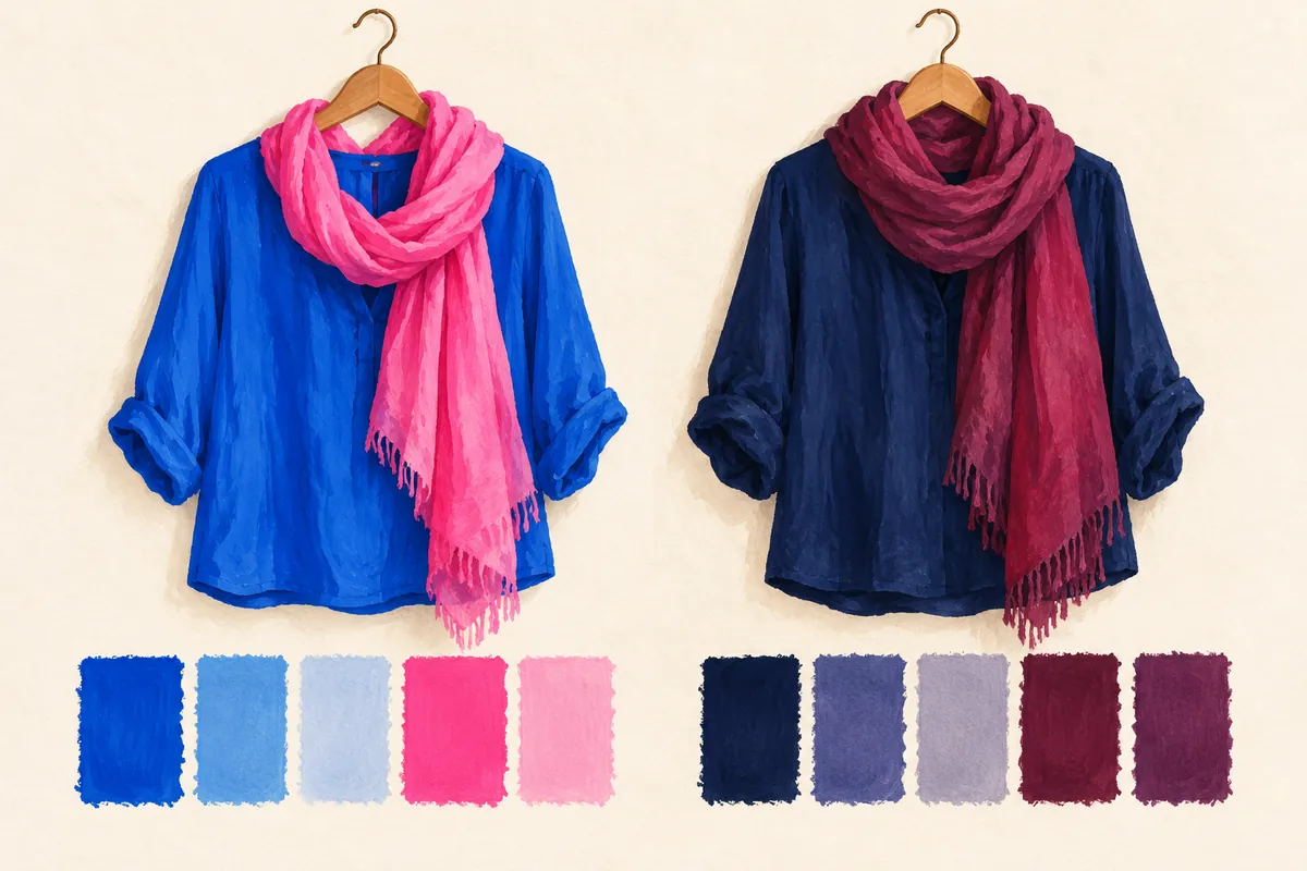
Wear a blue top with trousers of similar depth, then try it with a much lighter or darker piece. You have changed the outfit contrast while keeping the top. This helps distinguish “I like clearer blue” from “I like a stronger light-dark combination.”
A navy-and-slate outfit can be quiet; navy with crisp white can be more graphic. Neither combination needs a verdict about your eyes or lips to be wearable. Our depth and brightness guide explains the vocabulary.
Why a feature checklist may leave you stuck
Hair color, eyebrow depth, eye color and lip color give you several observations, but deciding which feature matters most can become a circular exercise. Instead of using one feature to disqualify a palette, compare its actual clothing suggestions.
For example, someone with dark hair may prefer softer blue near the face and reserve stronger contrast for shoes or a bag. That is already a usable outfit decision. A seasonal name is useful only if it helps you repeat choices you enjoy.
When the comparisons point in different directions
Make the result specific: “I prefer muted pink but clearer blue,” or “I enjoy bright color in small areas.” Keep those notes and test a second garment before deciding the whole family is wrong.
If the cool direction itself is uncertain, return to a neutral-undertone comparison. If Winter is the more useful starting point, our Bright versus Deep Winter guide addresses the next distinction.
Common questions
Can dark hair work with Summer-inspired colors?
Yes. Try the actual colors and combinations rather than rejecting them based on hair alone.
Does low contrast automatically mean Summer?
Use contrast as one styling variable alongside color intensity and your preferences. It is not necessary to decide a season from one feature or photograph.
Sources & further reading
Sources checked October 29, 2026. Comparisons and outfit exercises are our editorial styling suggestions. Seasonal frameworks are tools for exploring preferences. Sources have not endorsed this article or our app.
Published by the developer of Stylist AI. Our editorial approach · Suggest a correction
← Back to the journal