What is the difference?
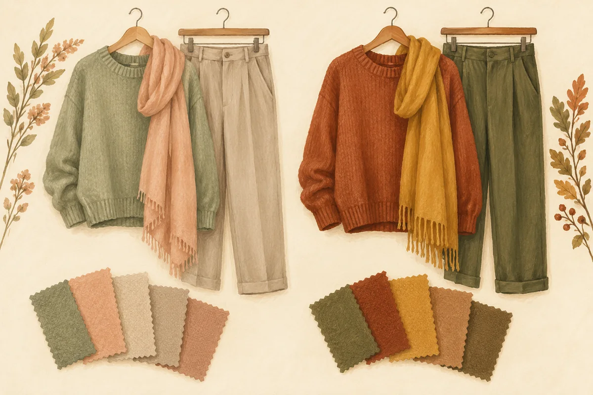
The Concept Wardrobe describes True Autumn as primarily warm and secondarily muted, while Soft Autumn is primarily muted and secondarily warm. Both belong to the Autumn family in that system. The distinction is a matter of emphasis, not “bright versus dull.”
| Compare | True Autumn direction | Soft Autumn direction |
|---|---|---|
| Main emphasis | Warmth | Softness |
| Useful clothing trial | Richer terracotta and warm olive | Dustier peach and gentle sage |
| What to keep similar | Garment size, fabric, lighting and approximate lightness | |
The clothing examples are starting ideas, not standardized diagnostic swatches. Check which system your analyst uses before comparing names: a label from a different system may not describe the same palette.
Use clothes you already own
Choose two or three pairs of tops, scarves or fabric pieces. A useful first pair might be a richer warm terracotta beside a dustier warm peach; another might compare warm olive with a softer sage. Try to keep each pair reasonably close in lightness. Comparing a pale scarf with a near-black coat changes too many things at once.
Retail color names are only a starting point. One shop’s sage may be much cooler or brighter than another’s. If you have a physical swatch from an appointment, compare the actual garment with it rather than assuming the name guarantees a match.
Make the comparison repeatable
- Use the same position, mirror and steady light for both fabrics.
- Keep the amount of fabric near your face similar. Compare one piece at a time.
- Write a plain preference: “I like this warmer green” or “the softer peach feels more like me.”
- Repeat with another color family before drawing a broader conclusion.
- Try the preferred piece with the trousers, jacket and shoes you would actually wear.
If photographs disagree with the mirror or change noticeably between shots, use our photo-lighting checklist. Do not increase the number of selfies until the lighting problem is resolved.
If you like some colors from each
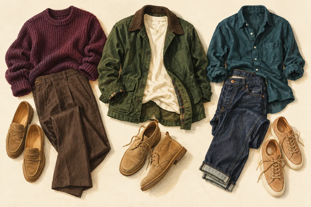
You can build a useful outfit before deciding on a final label. Try warm brown trousers with a softer peach top, or a muted olive jacket with a richer terracotta scarf. These are our outfit suggestions; you can adjust them to your taste and existing wardrobe.
Keep three notes: the colors you enjoy near your face, a neutral that connects your outfits, and one accent you want to try. Those notes can be more useful on a shopping trip than forcing every garment into one category. If a paid analysis left you uncertain, bring the actual garments and ask what the recommendation changes in practice.
Avoid changing your appearance to settle the label
Do not dye your hair, replace your jewelry or buy a complete capsule just to make one category feel more convincing. Eye and hair descriptions can be examples within a styling system; they are not a substitute for comparing the clothing options you need.
If you are deciding between warmer and cooler muted palettes instead, see Soft Summer versus Soft Autumn. If you already like the deeper Autumn direction, our Deep Autumn outfit ideas offer another practical starting point.
Common questions
Is True Autumn the same as bright Autumn?
In the framework discussed here, True Autumn is warm and muted. Richness is not the same as high brightness; check what a specific analyst means by their labels.
Can I wear Soft Autumn colors if I was typed True Autumn?
Yes. Try the actual garment and keep combinations you enjoy. A palette can guide experimentation without making other colors off limits.
Sources & further reading
Sources checked October 27, 2026. Outfit comparisons and examples are our styling suggestions, not validated tests or measured rules about attractiveness. Sources have not endorsed this article or our app.
Published by the developer of Stylist AI. Our editorial approach · Suggest a correction
← Back to the journal